by Eric Ciechanowski, CPRW, Career Advice WriterLast Updated: January 06, 2025
Hired By:*
Resume design ideas and templates
If you’re looking for good resume design ideas, you’ve reached the right place! Check out these professional resume templates in various styles and choose the one that best suits you.
Want help writing your resume? It’s easy: Click any resume template to edit it in our Resume Builder. Our Builder automatically formats your resume with over a dozen professional designs, plus you get personalized content you can copy and paste on all your sections.
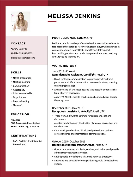
Professional resume design templates
These professional resume designs are clean and buttoned up, making them well-suited for many office or business roles.
Unique and edgy templates are best for graphic design resumes or those in creative or visual fields. They use bold colors and decorative flourish to showcase your creative side.
If you’re struggling to get hired because you won’t even land an interview, your resume’s design might be the key.
The way you present yourself to potential employers starts the moment your resume reaches their hands. Before that, however, it has to bypass an applicant tracking system (ATS) that will determine if you possess the basic job requirements.
To do that, the ATS has to scan your resume easily, and your resume’s design and template will affect its ability to do so. Run your resume through our ATS Resume Checker to verify if your resume is ATS-friendly.
In addition to ATS compliance, a well-designed resume shows recruiters that you pay attention to details and are willing to go the extra mile to create a polished document — all highly valuable assets in our current job market.
To help you make a splash in the applicant pool, we’ve compiled a list of all the resume design tips necessary to make a resume that impresses employers.
Pro Tip: Before considering design elements, organize your resume’s layout to highlight your strengths by choosing the right resume format for your experience level.
While you want to choose a resume font you like, it must also be clean and easy for both machines and humans to read. For the cleanest look, use sans serif fonts like:
Arial
Calibri
Nunito
Helvetica
Roboto
Rubik
Tahoma
Verdana
They’re sleek, current and reader-friendly.
For a more formal or classic look, these fonts work well:
Cambria
Georgia
Times New Roman
However, serif fonts are more complicated to read, so avoid using them unless you’re applying for a job in an old-fashioned profession, like medicine or law.
Pro Tip
If you recognize the font your target company uses to brand itself, consider using it for your resume. It will show that you’ve done your research and fit their style!
Step 2
Set the margins
Use 1-inch margins, the industry standard for all professional documents.
Google Docs and Microsoft Word use a standard 1-inch margin. Using a different margin size may make your resume design look too crammed or empty.
Also, 1-inch margins are necessary to help your resume pass an ATS scan. Most ATS software is programmed to read your document as having 1-inch margins; anything else may cause your resume to get discarded.
Step 3
Be selective about your design elements.
Include design features that make your resume pop, such as:
Complementing color combinations
Horizontal line dividers
Different color section headings
A bold resume header or banner
However, be careful not to overwhelm your resume with too many designs, hurting its ATS compliance.
To make an ATS-friendly resume, avoid:
Text boxes
Multiple column layouts
Photos
Graphics
Shapes
Overly complex designs
Step 4
Make the resume header pop.
The goal of your resume header is to be welcoming and visually pleasing to an employer’s eyes.
A little bit of color or design element, such as making the initials of your name larger, could make your resume header more eye-catching.
If a design flourish is on any part of your resume, it should be in the header.
Step 5
Use clear section headlines
Resume design relies on how your sections are separated and labeled. Clear sections make it easier for a hiring manager to scan your resume for the information they seek.
Avoid using atypical section headings unless they’re useful. You could divide your skills into hard skills and soft skills.
Just make sure the section headings are easy to read, only two to three words long and describe the information the reader will find there.
Step 6
Make wise use of white space.
White space makes your resume readable because it provides room for the eyes to breathe.
If your resume design lacks white space or is crammed with text, it may look like a headache for your reader. They may skip it altogether.
Find the right visual balance and give your sections clear separation.
Step 7
Use bullet points with care.
Bullet points have become a modern standard on resumes because they add a lot of white space and make shorter, snappier points.
However, it is possible to overdo bullet points on your resume! Try to limit them to a maximum of three sections. They’re appropriate for skills and work experience.
Avoid using them in your professional summary or objective statement!
Step 8
Aim to keep your resume one page long.
Many job seekers ask how long a resume should be. However, the answer isn’t as strict as you might think. It used to be that a resume should always be one page long.
One-page resumes are the standard and the quickest and easiest for recruiters to scan. However, there’s nothing wrong with extending your resume by a few pages. Times have changed, and now the accepted resume length is one page for every ten years of work experience.
So, if you’ve been working for 22 years, your resume can be two pages long. If you’ve been working for 40+ years, it can be four pages long.
Step 9
Save your resume as a PDF.
PDF is the most common format for sending your resume and cover letter because it allows your documents to be read the same way regardless of the device.
However, not every employer wants a PDF resume, so read the job post or ad closely to see if they request a different format. You can always email or call the company if you’re unsure.
It’s also common for online applications to have a place where your cover letter is uploaded, so it’s good to have a PDF copy of that, too!
Our unique tool, our Cover Letter Generator, helps you write a cover letter by generating personalized content from certified experts. Best of all, you can save it as a PDF.
Use a simple, easy-to-read resume font like Arial or Calibri. Maintain 1-inch margins to ensure your resume is both ATS-compliant and visually appealing.
Incorporate subtle design features such as color accents, horizontal dividers and a standout header to make your resume visually attractive without compromising its ability to pass through an ATS.
Clearly label and separate each section of your resume with concise headings, focusing on critical areas like work experience, skills and education.
Avoid complex layouts, text boxes, and graphics that could hinder ATS scanning. Instead, focus on a straightforward, one-column format that effectively highlights your qualifications.
Aim to keep your resume to one page, especially if you have less than ten years of experience. Use bullet points wisely to emphasize key achievements and skills and enhance the resume design’s readability.
Save and submit your resume in PDF format, which is the most secure way to ensure it’s formatted the same across different devices unless the job posting specifies another format.
Utilize professionally designed resume templates that suit your industry, whether creative, modern or traditional, and customize them to reflect your personal style and the job you’re targeting.
Over the past 15 years, we’ve helped more than 10 million job seekers build stronger cover letters, discover their career paths, interview confidently, and boost their chances of finding the right job faster. Review our Editorial Policy to learn more about our process.
☆☆☆☆☆
★★★★★
Rate this article
Share this article:
About the Author
Eric Ciechanowski • CPRW, Career Advice Writer
Eric is a Certified Professional Resume Writer (CPRW) and member of the Professional Association of Resume Writers & Career Coaches. He focuses on helping job seekers improve their professional resumes to highlight their unique skills and experience. Eric holds a B.A. double major in creative writing and philosophy from Tulane University and offers more than five years of specialized experience helping candidates navigate the complexities of today’s online job market, with a strong focus on resume optimization and effective self-presentation. He has had his work featured on LiveCareer’s resume builder and his career background includes fields as diverse as education, hospitality, journalism, copywriting, and tech.